Monday, December 31, 2012

Brown's Adaptation of Shakespeare's A Midsummer Night's Dream by Robert Darling


[1] A Midsummer Night’s Dream is not really realistic in its illustration but it is not necessarily cartoony either. The work is black and white but it does something else with this as well, it uses the two mixed: grey. This makes a big difference on the work, it eliminates the cartoony element that we see in other works such as Mau. This also gives more dimension to the work than the hashing of works like Road to Perdition—it is adding a third color to the basic color scheme of most graphic novels. It creates a world more like what you would see if watching the play on stage than if you were only reading the words to yourself or even out loud. So the illustration of the work/play is more uniquely suited for the person that is interested in Shakespeare but unable to find a showing and must pick the work up. 
CLICK BELOW FOR MORE

Kuper's Adaptation of Kafka's The Metamorphosis by Jessica Wolfe

1. The illustration in The Metamorphosis is pretty cartoony. There’s quite a bit of detail at times, but it still feels stark. There are a lot of rough edges and all the shading makes it feel heavy and gritty. It almost reminds me of the artistic style in Road to Perdition, but The Metamorphosis feels a lot darker and more oppressive. The characters have hollow eyes, which just seems weird to me, and the father’s eyes are crazy looking. There are also times when the narration is a bit hard to follow (p 42), because it winds its way around and across the page instead of staying in the frames. It works with the images depicted, however, as it suggests the same movement that is being illustrated.

CLICK BELOW TO READ MORE

Satrapi's Persepolis by Jesse Arthur


1) I would describe the illustrations in this novel as cartoony. The black and white frames do not have excessive detail, but the author provides enough detail for the reader to distinguish between characters in the story. I think is type of illustration is accurately suited for this story of a young girl growing up during the Iranian Revolution. In this novel I believe the words are often more important than the art and this style keeps the reader focused on the words.
CLICK BELOW FOR MORE

Satrapi's Persepolis by Brittany Schooling

1. Persepolis is drawn in an even more cartoony style than either Blankets or Maus. It doesn't have any shading and the detail is minimal. I think the outcome is almost fun, and definitely accessible. Like blankets, there are times when the art means more than the words, but the words are always there (we don't get pages and pages of silence) providing a narrative.

2. I think this story was written as a graphic novel to make a point with Marjane's age. Pretty much all of the book is written with Marjane being a girl or a young woman. So everything that's happening is being shown through the eyes of a small girl with an active imagination. If this were in a book or a live action movie, it would be too realistic, and the audience couldn't see these events as Marjane sees them.
CLICK BELOW FOR MORE

King's The Dark Tower by Michael Whalen


1.       
            The illustrations in this work are a unique blend of realism and cartoonism. The detail throughout the work is very good, it makes you think about the time and care put into every image in this book. The overall feel of the art is dark, very dark. Most of the work is colored in blacks, reds, browns, and yellows. This gives an almost hellish feel to the story which really accents the goal of the work. If this were illustrated in a different way I don’t think it would have worked as well as it  does..                                                                                                                                                                      
            
            CLICK BELOW TO READ MORE

Sin City (book version of The Big Fat Kill; complete cinematic version) Review by Marissa Hinton


Sin City is drawn in a very distinctive style. It often looks as if the whole comic takes place during the lightning storm of the century, with characters thrown into sharp, glowing relief against a simple, toneless world of pure black. When Sin City was converted into a movie, it was filmed in black and white with minimal lighting, and frames of the comic are interspersed with bits of the movie to add to the stylistic element which factors so heavily into the final product. In fact, there are some similarities to Road to Perdition in the way facial expressions are rendered. In places, ink smears and looks brushed, a technique used in Thompson's work quite often, though Miller's style of brushwork is brief, with shorter, harsher strokes. A final distinctive quality of Sin City's style is the use of white. Miller's technique of using it for detailing makes for striking artwork that looks more like white ink used over black drawings than it does reserved space and one color of ink.
CLICK BELOW FOR MORE

Saturday, December 29, 2012

Bechdel's Fun Home by Janne Classen


 1.        Fun Home is mixed cartoony and realistic. I like to consider it realistic with a cartoony twist. I say this because the faces have real details but arennot exactly real faces. For example, they have mouth/laugh lines but cartoony noses. There is no question as to who is in the panel as each character is distinctive, but the faces don't change much expression wise throughout the whole work. There are a lot of small details in the background of the panels. Details of the (ugly) furniture, the chandelier and the wallpaper, the father uses in the remodel. Compared to some of the other works we read in class, like Road To Perdition, the work is light on shading. It is all done in ink (black and white) except for the use of a watered down blue/gray color. This highly contrasted the bright orange color of my copy's cover. It was almost a trick, the cover was so bright and cheery but the context was heavy.  This style is perfect for the work I think. The narration is very heavy, if there were anymore colors the pages would be super busy and hard to follow.
CLICK BELOW FOR MORE

Friday, December 28, 2012

Vaughan/Staples' Saga, by Marc Runke


Saga Vol 1, written by Brian K. Vaughan, art by Fiona Staples
DISCLAIMER: This is even more than the works we did in class not a 'kids' comic. I would consider this a quite 'graphic' graphic novel, with ample nudity, a sex scene, and plenty of swearing and violence. That said, it is done in a way that highlights aspects of adult life. Worth a read if you're not easily offended.

1. Art Style
Saga I would consider to be done in something very close to traditional superhero comics style. Hard, black ink mix with pastels and brights to make a outlandish world that comes up somewhere between Star Wars, Oz, Wonderland, Narnia, Romeo and Juliet, and something else much seedier. It's not as artistically stylized as other works we looked at like such as Maus and Blankets, but it's also not in the area of ultrarealism of Road to Perdition. In some parts the lines used to shade clothing seem kind of loose and messy, but it doesn't hurt the style. The result is a sort of surrealist style where you don't question too much that the woman Alena has vestigial wings and the man Marko has horns, or that a line of alien robot princes otherwise look human except the televisions for heads, or that an alien bounty hunter named The Stalk has a woman's torso on a spider's legs ending in hands. I won't say you get used to it, but this a world where anything is possible, though it may very well be disturbing first.

CLICK BELOW TO READ MORE

Clowes' Ghost World by Jeff La Croix


1.      
      The illustration in “Ghost World” is rather simple and straight-forward. It follows a traditional style, with very defined and repetitive frames. In this sense, it reads kind of like “Maus,” and nothing like “Blankets.” Characters are drawn with some level of detail so that their expressions are obvious. In contrast, the background rarely has much detail, only enough to let you know where the scenes are taking place. Uniquely, the background is always green, white, and black. While you couldn’t describe this piece as colored, it betrays the typical dichotomy of colorful images versus black and white. I think that the gratuitous use of green lightens the piece a bit. Replacing all of the green with gray scale might make the imagery a little heavier and therefore make the subject matter seem more self-important. This isn’t the case, though, as the plot is fairly mundane in its nature.
  
     Of all of the pieces that I have read for this course, I would suggest that “Ghost World” would translate most easily to other mediums. I suppose that makes sense, as it has since been made into a movie. The illustration, use of frames, and dialogue are fairly simple. I think that it works just fine as a graphic novel, but that it could easily work as a film or even traditional prose. The only thing that we really gain (in my opinion) over the traditional novel is the constant and humorous style changes that Enid goes through.
 (CLICK BELOW TO READ MORE)

O'Malley's Scott Pilgrim: "Scott Pilgrim's Precious Little Life" by Austin Davenport


The story of Scott Pilgrim is divided into six separate volumes, so we will focus on volume one, “Scott Pilgrim's Precious Little Life”.  The artwork in the Scott Pilgrim series is very cartoonish and simplistic.  The faces of the characters are not very detailed, but the reader is still able to distinguish which character is which.  I resembles the template of the Charlie Brown series, where all the faces are the same, but certain details like hair or clothing show the differences between characters.  The feeling this artwork gives off is one of normalcy.  It is has a typical cartoon feel to it.  It has some aspects of “superhero” comics to it with the fight scene towards the end of the book, as it has lines in the background showing movement and words used to show sounds like “kpok” and “swok”.  The story is of a normal guy who wants to date a normal girl who has some not so normal ex-boyfriends.  Due to the fact that the main character is a “normal” guy, the artwork, to suit this tone of being “normal”, is itself a very “normal” looking cartoon style.
(CLICK BELOW TO READ MORE)

Miller/McNiven's Marvel Civil War by Dylan Perkins


 1.               For being a novel about superheroes, Civil War is drawn in a very realistic way. All of the characters and backgrounds are drawn with a large amount of detail, and even the characters that are of mutant/alien nature look believable. Even the fight scenes are realistically detailed, with injuries remaining consistant from panel to panel, as well as rips and tears to character clothing. Overall, this has to be the most realistically drawn superhero novel I have read.
2.               I don't believe this story would work in any other format for the simple fact that there is just too much going on in many of the frames. Without the ability to take your time and look at each individual frame, an enormous number of detailes would be lost. Not to mention how difficult it would be to cast so many different superheroes and villains. And as far as translating it to a purely written format: I wouldn't even want to begin describing a battle between 30+ superheroes with words alone. It would be nearly impossible to keep track of!
3.               There is no real narrator for this story. Different scenes focus on different characters, and while some are featured more prominently than others, you never get to see what the characters are thinking, only what they say out loud. The only exceptions to this are the notes left by Susan Richards and Reed Richards to each other at different points in the story, where they each narrate their inner thoughts and feelings about the conflict that is occuring. For a story with so many different characters and so many different viewpoints on the central topics, this is a very interesting narrative style that allows the reader to always be in the know while never quite knowing what is going to happen next.
4.               To me, the most significant scene is where Thor kills Goliath, causing Susan Richards to betray her comrades in order to help the rebels escape. This scene greatly emphasizes the central moral conflict the characters face throughout the novel: Just how far are they willing to go to fight for what they believe is right, and if it causes others to die, is it really right in the first place? Artistically the scene is very cinematic, with rain pouring down as Dagger, Cage, and Daredevil watch in shock and horror as Goliath slowly falls to the ground. This scene also occurs almost in the center of the novel, which I think is fitting since it completely changes the way many of the characters view the conflict.

Thursday, December 27, 2012

Gaiman/Russell's Coraline by Ali Siweckyj


1.      1. Coraline’s illustrations are realistic with just a hint of cartoon to them. Detail is given to characters and background alike, but not an inordinate amount like we saw with Blankets. This book is done in color, which is important to the storyline. In the story, Coraline travels back and forth from the real world to a world created by her “mother”. The alternate world is supposed to look just like her real world even though it is “evil”. The colors are not darker in this alternate world like one would expect them to be, and that makes it all the creepier. This story is supposed to be scary, and the illustrations only add to that.
2.       (CLICK BELOW FOR MORE)

Superman: Red Son by Chris Zellner


 Superman: Red Son. “The Great American Icon… Reimagined as a Soviet Hero”.
How Superman: Red Son is illustrated:
Superman: Red Son is drawn in a traditional, cartoony, comic book style. Some scenes in the graphic novel are brightly colored while other scenes are heavily shadowed and colored in darker tones. The colors of the scenes almost dictate the atmosphere and attitude of the settings. The early scenes from flashbacks to the Cold War are depicted as you’d imagine Cold War scenes would be, and as the story progresses through time the settings are drawn more and more futuristic.
Superman: Red Son as a Graphic Novel:
Superman: Red Son is a play on the traditional story of Superman. As if in an alternate universe, the premise of the book is that Superman crash landed as a baby on a collective farm in communist Russia and was raised by peasant farmers. The graphic novel is a great format to explore this alternate universe and allows the writers to re-imagine the story and characters. A fun and interesting example is how the writers explain where other superheroes fall into this parallel world. Batman, for example, is introduced as an anarchist opponent of Superman and as a “force of chaos” representing “the dark side of the Soviet Dream.” (p.68). Batman has a similar, traditional appearance, but because he is in Russia he has a fur tuft above the eyes on his mask for warmth. (CLICK BELOW FOR MORE...)

Eisner's Last Day in Vietnam by Teresa Buretta


Last Day in Vietnam: A Memory by Will Eisner

How is the work illustrated?
The graphics are cartoonish but detailed drawings. The book has a “Beetle Bailey” look and tone to it. The colors and even the paper it is printed on are sepia-tone. Backgrounds are coarsely textured in most frames and the paper is almost as thick as low-grade construction paper. Interspersed between each story is an actual photo taken in Vietnam to remind the reader that this is not just a fictional work.

Why was this story written as a graphic novel?
Will Eisner is a well-known cartoonist. This is a short collection of stories of his experiences and stories told to him during the Vietnam War. The graphics, although drawn comic paper style, put the reader into Vietnam with the writer. Along with being similar to “Beetle Bailey”, the stories and art have a “M.A.S.H.” tone also. You can see and feel the camaraderie among the troops and see both the tough soldier and the softer, more human side of the same person.

Who narrates the story?
Each story has a different narrator. The first narrator is a guide (probably for Will Eisner) who is scheduled to leave Vietnam that day. The second narrator is a young Vietnamese boy watching soldiers drinking on the terrace of a local hotel. The other stories are third person narratives written to show a side of the main character that they themselves could or would not show the world.

Describe one scene in the novel.
On page 42 the top frame shows a war correspondent with his head lying on a table on the terrace, The narrator tells the reader that the correspondent has just come from the field where he had found and identified the body of his son blown to bits. The unrealistic graphics are incongruously juxtaposed with the harsh reality of what really happens in a war.

Wednesday, December 26, 2012

Class Continues Tomorrow...

Despite the dusting of snow and ice we got yesterday, I think we'll be safe to return to school tomorrow.  Most of it will melt today and the roads seem passable in town already.  If you are commuting and deem it unsafe to come on Thursday, please use your own judgement.  Otherwise, I'll see you all back at 9:00 tomorrow for our discussion of Blankets.  Remember to post your questions on-line as a 'comment' if you haven't yet posted any comments...and start thinking about your outside graphic novel!  I'll give you a slight extension on that assignment from Friday to next Monday, just to be nice. 

See you soon!

Friday, December 21, 2012

For Thursday: Thompson's Blankets

 Remember, we have no class again until next Thursday, December 27th!  During the break, read Craig Thompson's Blankets and answer the template questions (your last ones!).  Also, remember that if you have not posted on-line yet, this is your last chance to do so (it's a required part of your participation grade).  Start thinking about your 6th graphic novel as well...e-mail me if you have any questions or concerns.

For more information about Thompson, check out his personal blog, where he discusses his latest projects and his past works: http://www.dootdootgarden.com/

Thursday, December 20, 2012

For Friday: Spiegelman's Maus II

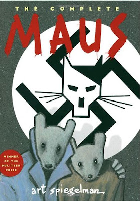
Remember to read Maus II for Friday's class and post your response to Question #4 on the Comics Template (you can do 1-3 if you wish, though most of them will be covered in  your previous response).  Pay special attention to Speigelman's discussion of the Maus metaphor and his struggles with writing the second volume of the comic in general.  Why does he turn down offers to make Maus a film--or a vest?  Also, consider how Vladek's characterization changes in the second volume, and what use Spiegelman makes of his real-life wife, Francoise, in the comic (why is she a mouse and not a poodle--or a frog?).  :) 

Critical Paper Assignment

In class on Thursday, I handed out the Critical Paper options for our Graphic Novels course.  Remember to do ONE of the three options (not all three!) and follow the basic instructions/prompt carefully.  There's a lot of wiggle room, of course, but make sure you're following the basic assignment and be sure to use at least 2 graphic novels and 2 secondary sources.  We'll discuss finding sources in class tomorrow (Friday).

Click on the link below for the assignment:

Wednesday, December 19, 2012

For Thursday: Spiegelman's Maus I

 For Thursday, read Maus I, "My Father Bleeds History" and answer the template questions.  Feel free to read the entire work if you like, but we'll break it up into two 'chapters' for convenience's sake.  He wrote and published Maus I years before Maus II came out, so depending on critical perception (which we'll discuss in class) it might have been the only volume. 

For context, here is a PBS slideshow interview taking pieces from numerous Spiegelman interviews over the years and juxtaposing them with images from his life, the comic, and other mediums.  This will give you some ideas to consider as you read and answer the questions for Maus I: http://www.pbs.org/pov/inheritance/photo_gallery_special_maus.php#.UNH2IpFJqW8

Tuesday, December 18, 2012

For Wednesday: Collins' Road to Perdition


For Wednesday, read Collins' Road to Perdition and answer the template questions (which are posted two posts down, in case you've lost them).  Like many graphic novels, the book was successfully adapted into a feature film starring Tom Hanks and Jude Law, though certain aspects of the story are downplayed while others are grafted on.  In an interview with Comic Book Resources website, Collins discusses the difficulty of writing the book:

"The trickiest aspect was my decision to use a first-person narration, with an adult Michael Jr. writing a memoir about his childhood experiences with his father on the road. That meant I had to use the somewhat outrageous device of having Michael tell us that he's about to report something he didn't witness, and is basing the upcoming scenes on true-crime accounts he's read filtered through his own knowledge of his father. Only the comic book medium would accommodate a narrative ploy of that sort. And I love the way it plays."

To read the entire interview, click here: http://www.comicbookresources.com/?page=article&id=1193

Monday, December 17, 2012

For Tuesday: Miller's Batman: Year One


Read Miller/Mazzucchelli's Batman: Year One for Thursday's class and complete the "response template" for Thursday's class.  Feel free to post any of your responses as a 'comment' to this blog (you must post at least one response for one of the four books this semester--see syllabus for details). 

"For me, Batman was never funny.  I was eight years old when I picked up an 80-page annual from the shelf of a local supermarket.  The artwork on one story looked good and scary...Glistening wet, black against the blackened sky, a monster, a giant, winged gargoyle hunched forward, pausing at a building's ledge, and cocked its head...Moonlight glanced across its back, across its massive shoulders, down its craned, cabled neck, across its skull, striking a triangle at one pointed bat's ear.  It rose into space, its wings spread wide, then fell, its wings now a fluttering cape wrapped tight about the body of a man...the 80-page giant comic cost 25 cents, but I bought it anyway."  --Frank Miller

Sunday, December 16, 2012

The Comics Response Template


THE COMICS RESPONSE TEMPLATE

Click on the link below to view the 4 standard questions: 

Welcome to the Course!


Humanities 4983: Graphic Novels (or, Comic Books as Literature)
Winter Intercession 2012 / Horace Mann 325 / Dec.17-28 (9:00-1:00)

“The comics creator asks us to join in a silent dance of the seen and the unseen.  The visible and the invisible.  The dance is unique to comics.  No other art form gives so much to its audience while asking so much from them as well.  That is why I think it’s a mistake to see comics as a mere hybrid of the graphic arts and prose fiction.  What happens between these panels is a kind of magic that only comics can create.”  --Scott McCloud, Understanding Comics 

Welcome to the course!  I look forward to offering this brief introduction to the comic book form, which I feel is one of the most innovative forms of 20th/21st century literature.  Comics were never kids' stuff, but they became associated with the rise of newspapers comics in the early teens and twenties, followed by the super hero explosion of the 30's and 40's.  Now, in the post WWII era, comics have expanded to truly literary realms, becoming bona fide novels that deal with more than super powers or travels to distant galaxies (though yes, this still happens!).  In this course, I will introduce you to 4 important works which we will discuss, examine, and consider from various perspectives.  Ideally, you will leave this class with an appreciation of the graphic novel as literature, art, and language--one that allows both writer/artist and reader to see a larger world than traditional literature is often capable of achieving.  
Click on the link below for the syllabus: 

Some Final Paper Resources, Part 3: Cultural Significance of Comics

For those of you interested in exploring the cultural significance of comics, there are many articles and discussions about how comics both ...